- 首页
- International
- 艾特奖
- 文化节
- 服务体系
-
网站导航
zebar (HK)
Our client is found by four partner, they come from Hong Kong and Guangzhou.
Zebar are the partnership which have vision for what they want to do. For the reason of why founder want to open a bar, they discovered their culture that is big different of bar industries. In Hong Kong, they found that the customer easy to meet new friends. On the other hand, customer are shy in Guangzhou. That's create a gap for both side which is the issue on what they think.
In this project, our client hope that can engages the location and human giving a new approach to make energy through design.It was challenging the site surrounding and the consideration of internal building like rectangle-shape floor plan, high-height facade and internal space. But aside for impression of approach.
As we discovered that the site, some people were always attracted by high-light direction when they were sightseeing. Then, the local citizen were giving a first impression which are so static state on site, So that was a issue we think interest.
For internal, How to interacted our user and staff must the main point of view for this spacing. The lighting and spacing planning were an important part for client and user. We combined the old-type iron gate and historical furniture and new hot game style. Besides, we controlled the spacing between the seating area and interactive area.
For Zebar, We designed a package about the bar branding. We hope that will giving a new energy power for site and space.
One of the key element is folding door which is a historical thing early Hong Kong. It gave a memories to local people and founder. The door was connected one by one and always found in 40's Hong Kong. So that's why we transformed this element in our design.
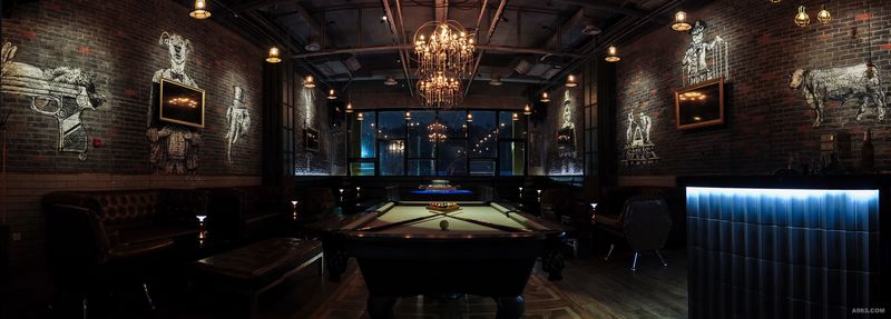
The other one is Beer pong, is a hot style for new entertainment nowadays. We try to combine this table game inside the building, in which interacted the bar area and seating area. We hope that can break the gap for someone who create a conversation easily.
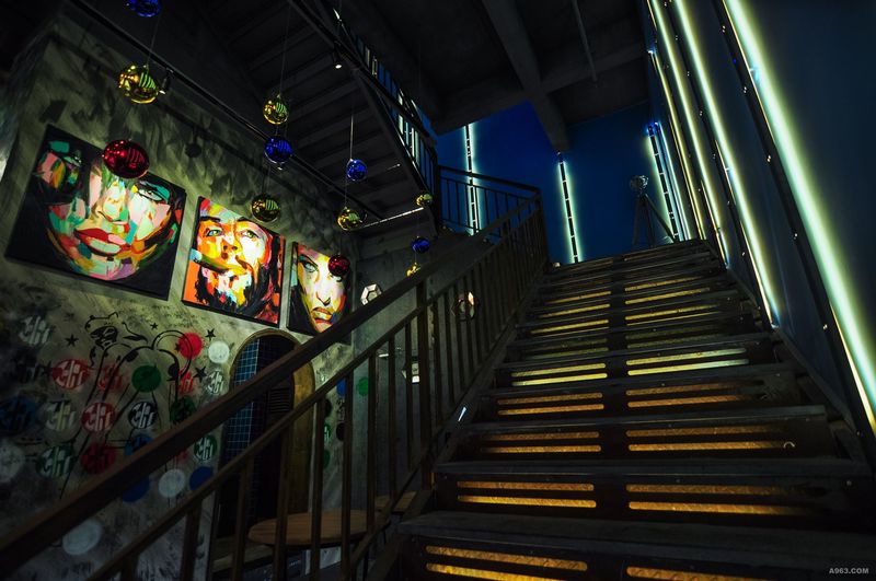
The last one is Dark humor, it mixtures the society, art and human as inspire the imagination of thinking and visualization like the a piggy man, lady-gaga and animals. Get it fresh. Get it bright.
For floor finished, we used a different kinds of tiles and concrete floor. The tile provide a lot of combination like the rectangle, hexagonal and square. It easy to separate the different zone apart from wall partition used only.
On the top of ceiling, we only used the bronze metal and original ceiling color. As we considerate the hold thing, simple makes a strong combination on elevation and floor finished.
2/f, it was dynamic that people can focus on the relationship of their peer, There were two VIP area and multi functional changed to private zone. We use a full height gate, wooden furniture and exaggerate art drawing to build up that zone which create a elegant mood. It look like traditional but not old-school. The contrast is between the darkness and brightness, the colorful and simple.


